Big glow up, same craving. We've just rolled out a full rebrand, and this is us walking you through it properly: the new look, the new stores, the new face of the brand, and why none of it changes what actually matters, the food.
It started with a craving
Back in 2014, our founders discovered US comfort food at its best: crispy wings, loaded wraps, and sauces that brought every bite to life. We brought that energy home and built Wraps & Wings around one idea: premium halal comfort food, no compromises. From our first bite to over 1M customers a year, we're still chasing the exact same thing. That craving you can't stop thinking about.
A glow up, done properly
New logo, new fonts, new colour palette. We've spent time getting our visual identity to actually match the brand, done through simplicity rather than anything flashy. We wanted something that feels contemporary and has a bit of attitude, without turning into another generic fast casual identity that blends into the high street.
Meet Wrappie
Say hello to Wrappie: a wrap, with wings, because obviously that's what our mascot had to be. We weren't about to give you a random chicken or a floating flame emoji character. Wrappie is quite literally our name come to life, and honestly, once we drew a wrap with a pair of wings on it, there was no version of this brand that didn't have him in it. He's cheeky, he's a bit chaotic, and he's very much on brand for anyone who's ever debated whether they're a wrap person or a wing person. Expect to see a lot more of him.
.png)
New spaces, same craving
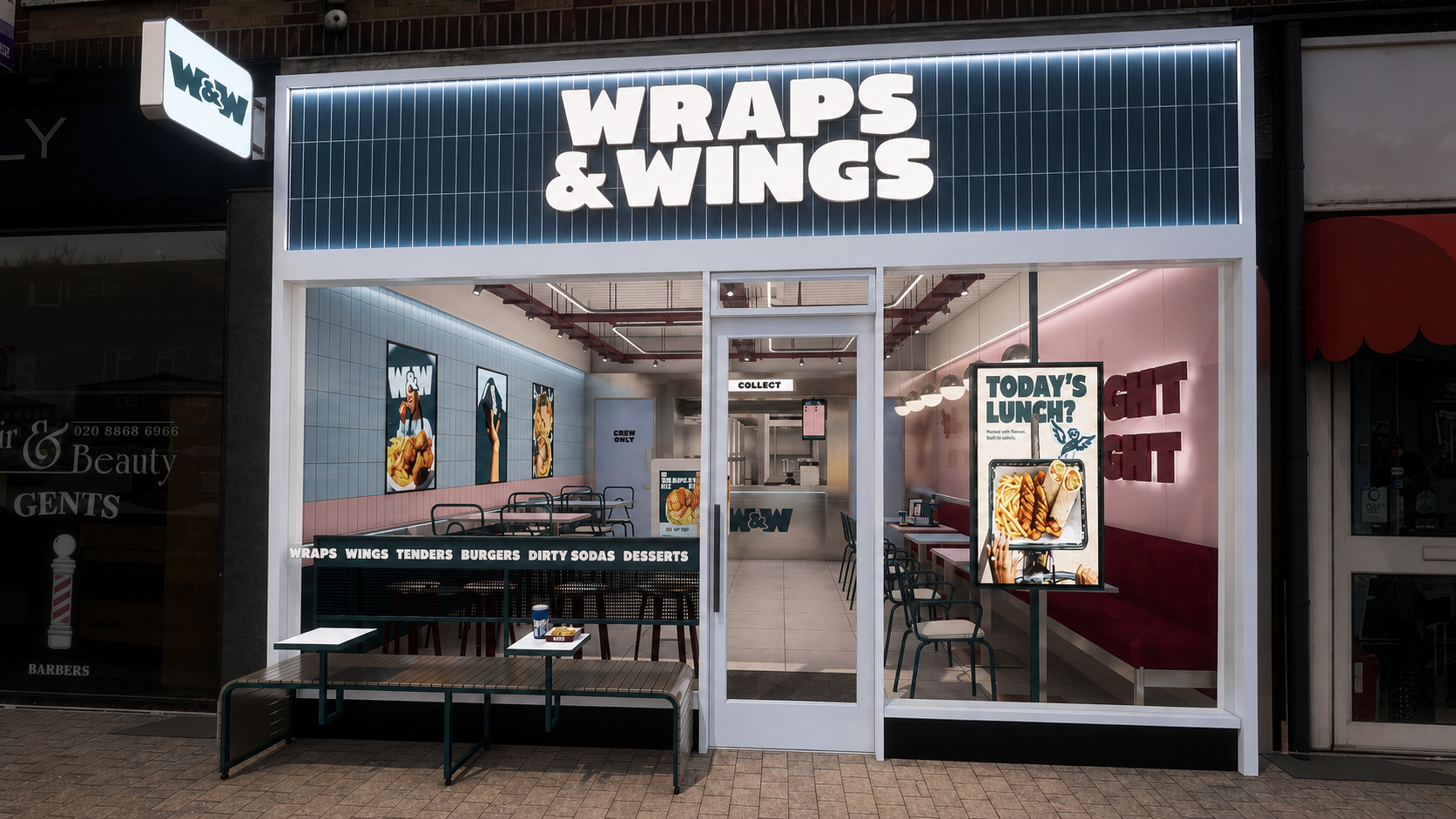
The rebrand isn't just logos and colours, it's the stores themselves. We've redesigned the format from the ground up, and it's about to make its first appearance at our next opening, before rolling out across our locations from there.
Inside, expect bright, energetic spaces, no dark or moody interiors here. We've gone for an honest mix of materials that feels real and functional rather than dressed up: ceramic tiles, metal finishes, LED lighting, digital screens, and exposed services that give the whole space a proper contemporary edge. Outside, you'll spot teal-effect fascias, stainless-steel-style framing, and illuminated signage that make it easy to clock a Wraps & Wings from down the street.
We've also rethought how you move through the restaurant. Ordering, waiting, collection, dining, and takeaway now each have their own clear space, with double-sided self-service kiosks and touchscreen terminals to keep the queue moving even when it's slammed. Counters are there to get your food to you fast, not to make you stand around waiting to order.
More Wraps & Wings, coming to a high street near you
We're growing too. 20+ new locations are landing across the UK over the next two years, and every single one will carry the new look from day one, so more places to get your fix whether you're eating in, taking away, or getting it delivered.
New logo, new stores, new mascot, same obsession with getting the food right. Nothing about who we are has changed, we've just built something that actually looks like us.